TL;DR
Read time: 8 seconds

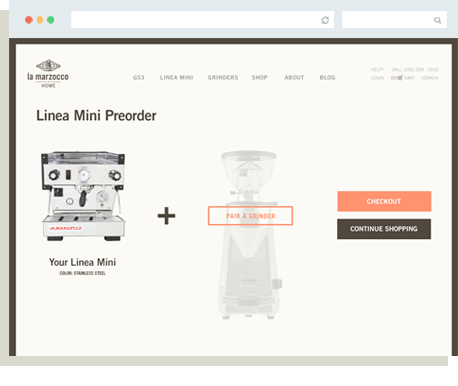
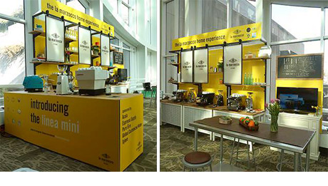
It takes a village to cross categories

All brands can benefit from outside expertise. Entry into a new market is an ideal time for an objective assessment of your company's reason for being, and to trim excess baggage from the brand's messaging and visual identity. It may feel like extra work but being secure in who you are will make it easier for your team and vendors to ensure a consistently on-brand experience in support of your go-to-market strategy.

Got it

Lm Hero Image
Home  /  Work  /  La Marzocco
TL;DR Read time: 8 minutes

How to Extend a Brand from B2B into B2C

La Marzocco manufactures espresso machines. For 90 years they sold to cafés. We helped them renew their brand’s focus and expand their cult loyalty to a new market segment.

1. Thumbs Up Icon2

This project was rare in that the basic ingredients for a successful brand already existed—La Marzocco had an ownable position in the market, a product innovation legacy with indisputable reasons to believe and core values that retain and attract top talent.

The brand's purpose and personality just needed to be fine-tuned to rally La Marzocco’s global team.

 
Bs Tattoo
Photo courtesy of www.specialtycoffee.nl

a. Know Your Audience

 
Bs A Know Your Audience Graphic

First we tackled cultural alignment with key brand story elements. We applied our brand strategy process to structure the dialog and unite disparate teams in Florence, Italy and Ballard, Washington around the emotional heart of their story.


We emphasized 1:1 in-depth interviews for the qualitative research. First we listened to La Marzocco team members who would be responsible for the growth of the company. Then we talked with current and future customers in both their commercial and consumer markets.

We learned that La Marzocco sets the standard of excellence in their industry. They’re perceived as a trustworthy company that manufactures durable machines. The machines are synonymous with the Third Wave of coffee (a cultural trend they helped to create).

Regarding behaviors and motivations, we learned that the people who buy these machines have amazing kitchens and want their machines to fit their lifestyle. We combined that insight with an emphasis on La Marzocco’s lineage to anchor the messaging and design of the B2C launch.

Empty2

b. Get to the Point

No one can outcompete La Marzocco on their 90-year heritage or legacy of innovation. They’re one of the few brands to support each evolution in the coffee market—from the dawn of Starbucks and café culture as we know it today, to the rise of the Third Wave’s emphasis on artisan quality. Their brand’s big idea interprets their humble leadership role broadly so they can continue to be a trusted partner to the industry (B2B) and a symbol of the ultimate luxury kitchen accessory for home coffee connoisseurs (B2C).

 
Bs B Get To The Point

c. Share the Work

Bs C Share The Work
 

The ideal way to culminate brand strategy is video. After months of diligent work, it was time to educate the entire La Marzocco team about the changes.

Working closely with the global and U.S. marketing teams, we scripted and produced a video that combined La Marzocco’s trove of historical still photographs with modern live action and an instrumental score.

To see the video, please email us and request a password. We know, pain in the arse. But we respect our client’s privacy.


Truth Bomb

A common mistake when rebranding is to cheap out on educating the company about the new brand. Live presentations supported with video are the quickest, most memorable ways to rally your team. Printed handouts and tangible items like t-shirts, hoodies and coffee mugs are also impactful. Avoid the impulse to trim costs on the rollout and budget accordingly to maximize the return on your brand investment.

2. Finger Print Icon2

For La Marzocco’s initial foray into direct-to-consumer sales, we created an ecommerce website for a designer lifestyle customer.

We learned through research that if people are going to spend a lot of money on an espresso machine for their home, they want it personalized. So the heart of this site is a Configurator that allows customers to change out the options to envision and order the perfect machine for their kitchen. This feature also generates data on customer behavior that La Marzocco uses to refine the machines and inform future products.

In the past the only way to buy a La Marzocco machine was through a coffee roaster. This site creates a direct connection with customers without eroding the coffee roasters’ resell business. In fact, La Marzocco realized that the site’s educational features have helped the roasters sell even more machines


Lm Configurator Page
Configurator
Empty2

3. Rocket Launch Icon2

After unveiling the La Marzocco Home website, we helped to launch another product line — the Linea Mini. The concept was a chip off the iconic block, with a bright yellow look exclusively for the offspring.

Linea Mini Launch Magazine Spread
Linea Mini Launch Home Page
Linea Mini Launch Homepage Carousel
 
Linea Mini Launch Preorder Page
Linea Mini Preorder Page

The Linea Mini campaign launched at a major industry tradeshow a few months before product availability. For that event, our friends at Department of Energy extended the design language to a booth.

Our concept for the launch also extended to La Marzocco’s display booth at the renowned SCAA tradeshow. This work was done in conjunction with Department of Energy.

 
Linea Mini Launch Scaa Booth
SCAA Booth. Photo courtesy of Dept. Of Energy www.deptofenergy.com

4. Parachute Crate Icon2

Made in Florence and shipped to homes throughout the U.S., the Linea Mini packaging needed to be durable and make a statement.

We approached this packaging in two phases. First we explored concepts for form factors that would be durable enough to ship across oceans, disassemble for bench testing and repackage the same box for final shipment to the customer with an a-ha moment included.

We also explored ideas that allowed the Linea Mini packaging system to be versatile enough to use for all La Marzocco espresso machines and shipped to their commercial partners. We took the extra step of considering how the box might be repurposed for merchandising.

Packaging Form Factor Schematic 1
Form Factor Study
 

The chosen concept focused on a “box within a box” execution. This supplied an outer shell for protection and inner shell for brand showcase. It also made it easier to unload the machines (good for tender backs). And the bold pop of red greets customers with a happy “Hey there!” as they unbox their new baby.

Packaging Form Factor Schematic 2
Form Factor Study
Final Packaging Image
This was the first packaging system in La Marzocco’s history.

Truth Bomb

We worked with an international vendor on La Marzocco’s packaging system. It was not easy. On this project we didn’t have direct contact with the printer, which resulted in ~10% in additional design fees (due to having to work through a grape vine). Give your design team direct access to save money and sanity.

5. Gift Box Icon2

La Marzocco’s cult status springs from their roaster partners. As a way to express their appreciation for this loyal community, we created gifts to support La Marzocco’s annual Partner Summit conferences. The gifts had to be both thoughtful brand expressions and collectible.

Lm Ps Year 1
 

Year 1: Bring out the Lion

The concept was to remind Partners of the power of the brand’s symbol and namesake, the lion. We made this guy out of laser-etched walnut and delivered in a letter pressed package. It cost ~$5.50 per unit.

Year 2: Message in a Bottle

The year was about reaching out with a reminder of the power of partnerships in commerce. We used a quote by Henry Ford and stainless steel to reflect the material of the machines. It cost ~$6.50 per unit.

 
Lm Ps Year 2
Empty2

6. Now Open Icon2

Take it offline.

The final touchpoint in brand’s experience is La Marzocco at KEXP. This is a destination for the La Marzocco brand, a café that serves as a stage for the world’s best coffee roasters and baristas, a showcase for La Marzocco Home, and an event space for the coffee community.

We helped La Marzocco message the key storylines for the café’s launch. This work was used by their team and PR firm to maintain consistency as they talked with partners and the press.

We also collaborated with the project’s architects and extended the brand's design language to the showroom. A key feature is the hand-drawn mural of Florence that wraps around the exterior wall, anchoring the brand to its Italian roots.

 
Lm Kexp Cafe Hero

Concept Drawing of Perimeter Walls

 
Lm Kexp Concept Drawing

Final Execution

 
Lm Kexp Detail 1
Lm Kexp Detail 2
Lm Kexp Detail 3
Lm Kexp Detail 4
Lm Kexp Detail 5
Lm Kexp Detail 6
Lm Kexp Detail 7

Shit no one else will tell you:

The website project incurred huge scope creep. It started in wireframes. La Marzocco approved the wireframes, which finalized their site’s UX. But what they didn’t realize and we failed to hit home is that finalizing wireframes locks down the content and architecture of the website.

As we moved on to visual design, the client was hard pressed to visualize how the site would appear and the user flow. Many, many changes were made after wireframe approval. Changing design post-wireframes gets expensive because you have to rethink both design and UX at the same time. That’s where scope creep came in, this was as much our fault as the client's.

We let this happen without charging the client because we wanted to deliver a great site and we fell in love with the work and the client (amateur move). We kept changing and revising to please the client, in turn ratcheting up the tension because the meter was ticking and we weren’t getting paid. The business lesson is to be honest about scope creep, early and often. And to pay attention to wireframes. Please.