
Unite your brand with a visual identity
After working on over a hundred branding projects through the years, I consistently hear the same questions when meeting with potential new clients.
They go like this: “Our communications don't all look the same, and my team does things differently on everything. How do I unify the look of our brand across multiple channels?”
Or these: “How do I create a consistent look?”
“How do I tie the look of my brand together?”
“I have my logo and color palette, but what do I do for the graphics on my website, content marketing articles, PowerPoint, brochures, etc.?”
All of these questions point to the same need, one that is essential for every brand. The answer is you need a visual identity. Despite the many terms for this—visual language, brand system and visual kit of parts—it’s all the same need.
So what is a visual identity and what will it do? Isn’t an identity a logo?
First, let’s talk about logo versus identity.
What’s a logo?
A logo is a graphic symbol that represents a company or product. It’s essentially a flag. A flag is a universal symbol, and identifier for something big and important, be it a country, an organization, company or a team.
A logo is one part of a visual language or system that identifies a brand. It’s the most recognizable part of what identifies you.
What’s a visual identity?
I like to think of a brand as a person. A visual identity is equivalent to the styled wardrobe of person. A wardrobe consists of pieces such as shirts, pants, sweaters, jackets, shoes, socks, accessories, etc.
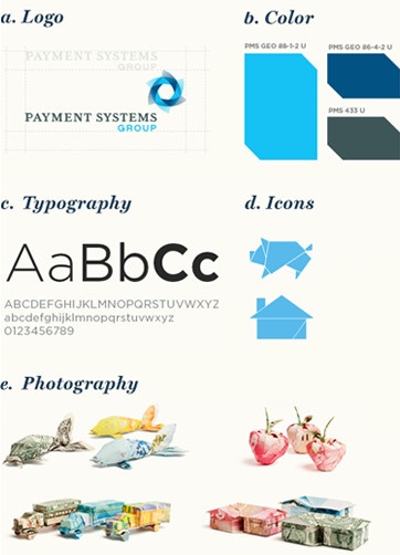
A visual identity is a visual system or language that consists of a brand's logo, color palette, typography, photography, illustrations, icons and patterns. (Look at the Payment Systems Group Visual ID for an example of a full identity at work.) It’s the unique combination and consistent use of these elements that creates the visual identity of a brand.
People usually don’t wear the exact same thing all the time. It changes according to the circumstances, say for work or play, or for an evening out versus hanging around the house watching The Big Bang Theory reruns.
Brands use various combinations of their wardrobe based on what they’re doing and how they want to be perceived. Regardless of the channel or scenario, brands with strong visual identities have a specific style or look that identifies them.
Not many people wear the same thing everyday. It gets boring. If you’ve seen a person long enough, you’ll be able to identify them without seeing their face simply by what they're wearing.
This is the same concept for a brand. You can identify a brand when they consistently use the same elements, but with varying combinations to keep it fresh and interesting.
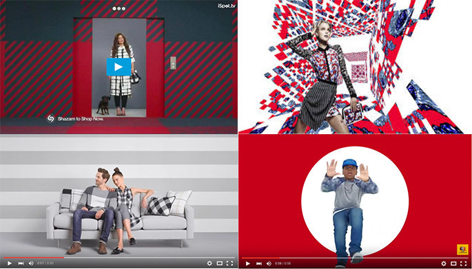
For example, you can spot a Target television ad in the first few seconds. That’s because of the bright style of photography, the use of the color red, the creative use of the target pattern and the sense of fashionable whimsy. It all adds up to a strong identifier. You know it’s a Target ad before they show their logo. This is fundamentally the function of an identity system.
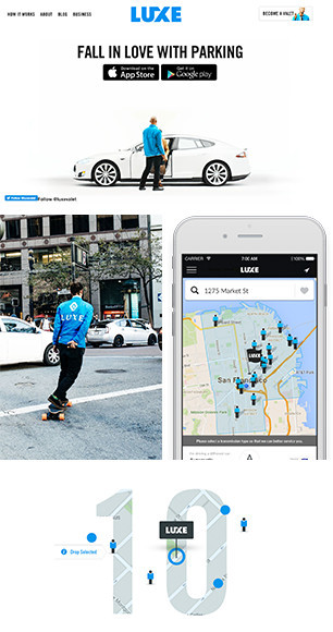
Luxe Valet is another good example, this time for a startup. They're a parking service founded in San Francisco in 2013. For a startup, their brand identity is concise and iconic, an echo of their value propositions of keeping things easy, fast and convenient. The identity system is simple and effective. Luxe flawlessly composes it’s basic identity elements of a bold logo and bright blue beautifully across it’s touchpoints from their uniforms to the app's user interface.
Their use of white space is a big point of difference. They use it strategically to convey premium status and reinforce the ease and simplicity of using their service. Luxe’s brand identity illustrates how you can do a lot with just brand identity basics.
You are what you wear
Every brand identity ultimately needs to underscore the brand’s defining personality attributes and the overall real estate the brand wants to claim in the customer’s mind.
The visual identity elements should be carefully curated and created much like someone carefully styles their wardrobe so it carves out a unique perception. Defining your style is key in creating your wardrobe. It’s critical for your brand, and that is called brand strategy.
So remember, you are what you wear. A logo is a brand's most recognized identifier and visual identity is a set of wardrobe essentials for your brand. It’s important to define your style before you begin creating your wardrobe, otherwise you’ll have a confused look.